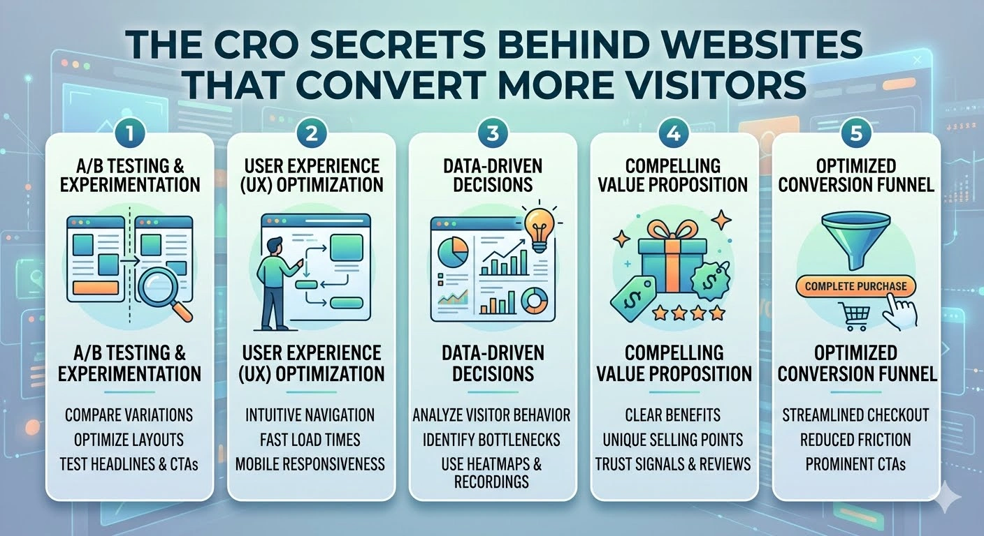
The CRO Secrets Behind Websites That Convert More Visitors
The CRO Secrets Behind Websites That Convert More Visitors | Getting thousands of visitors to a website sounds impressive, but traffic alone does not guarantee business success. A website can attract visitors through search engines, social media, advertising, or referrals and still generate very few leads or sales.
This is where conversion rate optimization (CRO) becomes important.
CRO focuses on improving a website so that a larger percentage of visitors take a desired action. That action could be purchasing a product, submitting a form, signing up for a newsletter, requesting a quote, or booking a service.
The most successful websites do not simply ask visitors to convert. They remove friction, build trust, communicate value clearly, and make the next step obvious.
So, what are the CRO secrets behind websites that convert more visitors?
What Is Conversion Rate Optimization?
Conversion rate optimization is the process of improving a website or landing page to increase the percentage of visitors who complete a desired action.
A simple conversion rate formula is:
Conversion Rate = Conversions ÷ Total Visitors × 100
For example, if 1,000 people visit a landing page and 50 complete a purchase or signup, the conversion rate is 5%.
The goal of CRO is not necessarily to increase traffic.
Instead, it asks an important question:
How can the existing traffic produce better results?
1. Make the Value Proposition Obvious
One of the biggest CRO mistakes is making visitors work too hard to understand what a website offers.
When someone lands on a page, they should quickly understand:
- What is being offered?
- Who is it for?
- What problem does it solve?
- Why should they care?
- What should they do next?
A strong headline can communicate the primary benefit immediately.
Instead of writing:
“Welcome to Our Digital Solutions Platform”
a clearer alternative might be:
“Create Professional Websites Without Hiring a Developer”
The second headline explains the benefit and target audience more directly.
2. Use One Clear Primary Call to Action
Websites often overwhelm visitors by presenting too many choices.
A page might contain buttons for:
- Buy Now
- Learn More
- Contact Us
- Download
- Subscribe
- View Products
- Book a Demo
Having multiple actions is not always wrong, but the primary goal of the page should be obvious.
A strong CTA tells visitors exactly what to do.
Examples include:
- Start Free Trial
- Get Your Quote
- Book a Consultation
- Download the Guide
- Create Your Account
The more clearly the next step is communicated, the less mental effort visitors need to make.
3. Reduce Friction
Every unnecessary obstacle can reduce conversions.
Friction can come from:
- Complicated forms
- Slow pages
- Confusing navigation
- Unexpected fees
- Required account creation
- Too many checkout steps
- Unclear instructions
- Broken buttons
Imagine a customer has already decided to purchase but encounters a checkout form asking for unnecessary information.
The customer may abandon the process.
Good CRO identifies these obstacles and removes them wherever possible.
4. Build Trust Before Asking for the Conversion
Visitors do not automatically trust a website.
They may wonder:
Is this company legitimate?
Will I actually receive what I paid for?
What happens if something goes wrong?
Trust signals can reduce these concerns.
Useful trust elements include:
- Customer reviews
- Testimonials
- Case studies
- Secure payment information
- Clear contact details
- Refund policies
- Guarantees
- Recognizable certifications
- Customer logos
Trust signals should be genuine and verifiable.
Fake testimonials or misleading claims may produce short-term gains but can seriously damage a business’s reputation.
5. Use Social Proof
People often look at what others have done before making a decision.
This is known as social proof.
For example, a website might show:
“Trusted by more than 10,000 customers.”
Or it could display customer testimonials describing specific results.
The strongest social proof is specific.
Instead of:
“Great service!”
a more useful testimonial might explain:
“Our team reduced the time required to process customer requests by 40% after switching to the platform.”
Specific experiences are more persuasive because they provide context.
6. Write Copy Around Customer Problems
Many websites focus too much on themselves.
They talk about:
- Their company
- Their history
- Their technology
- Their features
- Their awards
Visitors are usually more interested in how the product or service can help them.
Instead of simply listing a feature:
“Automated reporting dashboard.”
Explain the benefit:
“Generate performance reports automatically and spend less time compiling data.”
Features describe what something does.
Benefits explain why the customer should care.
7. Make the Website Easy to Scan
Most visitors do not read every word on a webpage.
They scan for information that seems relevant.
That means effective websites use:
- Short paragraphs
- Clear headings
- Bullet points
- Highlighted benefits
- Visual hierarchy
- Descriptive buttons
- Plenty of whitespace
A visitor should be able to understand the main message by quickly scanning the page.
Good design is not only about looking attractive.
It is also about making information easy to process.
8. Improve Page Speed
Website performance can have a direct impact on user experience.
Visitors are less likely to continue interacting with a page that takes too long to load.
Common causes of slow websites include:
- Large images
- Excessive scripts
- Poor hosting
- Unnecessary plugins
- Unoptimized code
- Too many third-party services
Improving performance can make the website feel more responsive and reduce frustration.
A faster website can also support better user experience across mobile devices and slower connections.
9. Design for Mobile Users
A website may look excellent on a desktop but perform poorly on a smartphone.
That is a major problem because many users browse and shop primarily on mobile devices.
Check whether:
- Buttons are easy to tap
- Text is readable
- Forms are comfortable to complete
- Images fit the screen
- Navigation is simple
- Checkout works properly
Mobile CRO should not simply shrink the desktop version.
The experience should be designed around how people actually use smartphones.
10. Make Forms Simple
Forms are often one of the biggest sources of conversion friction.
A business may want to collect as much information as possible, but every additional field creates another opportunity for abandonment.
If a visitor only needs to request a quote, they may not need to provide extensive personal information.
Start with the information that is genuinely necessary.
For example:
Simple form:
- Name
- Project details
This may be more effective than a long form asking for dozens of fields.
11. Create a Sense of Clarity
Visitors should not have to guess what happens after clicking a button.
Compare:
Submit
with:
Get My Free Quote
The second option communicates the outcome more clearly.
Clear microcopy can also answer questions near important actions.
For example:
“No credit card required.”
or:
“We’ll respond within one business day.”
Small details like these can reduce uncertainty.
12. Use Visual Hierarchy Strategically
Not every element on a page should have equal visual importance.
A strong page guides attention toward the most important information.
A typical hierarchy might be:
Headline → Value proposition → Supporting information → Social proof → CTA
Design elements such as font size, spacing, contrast, and placement can help establish this hierarchy.
The objective is not to make everything stand out.
It is to make the right things stand out.
13. Test Instead of Guessing
One of the most important CRO principles is experimentation.
A design that looks better to a marketing team is not necessarily the design that converts better.
A/B testing can compare two versions of an element.
For example:
Version A: “Start Now”
Version B: “Start Your Free Trial”
If Version B generates more qualified conversions under a sound test design, the data provides evidence about which message works better.
Tests can involve:
- Headlines
- CTAs
- Images
- Forms
- Pricing displays
- Page layouts
- Product descriptions
- Testimonials
The key is to test meaningful changes and evaluate results carefully rather than changing everything simultaneously.
14. Understand Where Visitors Come From
Not every visitor has the same intent.
Someone arriving through a search query such as:
“best accounting software for small business”
has a different intent from someone clicking a general social media advertisement.
CRO should consider the visitor’s source and expectations.
A landing page should match the promise made before the click.
If an advertisement promotes a free trial but the landing page immediately asks visitors to purchase a premium plan, the mismatch can create confusion and reduce conversions.
15. Address Objections Before They Become Abandonment
Potential customers often have questions that prevent them from converting.
For example:
- Is it safe?
- How much does it cost?
- Can I cancel?
- Is there a refund?
- Does it work with my existing tools?
- How quickly can I get started?
A strong website answers these questions before visitors have to search for the information.
Frequently asked questions, comparison tables, guarantees, demonstrations, and transparent pricing can all reduce uncertainty.
16. Use Analytics to Find the Real Problems
CRO should be based on evidence.
Analytics can help identify where visitors leave the conversion process.
For example:
Landing page → Product page → Cart → Checkout → Purchase
If many users reach checkout but leave before completing payment, the problem may not be the landing page.
Potential issues could include:
- Unexpected costs
- Complicated checkout
- Limited payment options
- Technical problems
- Lack of trust
- Confusing instructions
Understanding the funnel helps businesses focus their optimization efforts where they matter most.
17. Don’t Optimize Only for Conversion Rate
A higher conversion rate is not automatically better.
Imagine one version of a website generates 10% more signups, but most of those users never become paying customers.
Another version generates fewer signups but attracts customers who spend significantly more.
The second version may be more valuable.
For this reason, businesses should consider metrics such as:
- Revenue per visitor
- Customer acquisition cost
- Average order value
- Lead quality
- Customer lifetime value
- Retention rate
CRO should ultimately improve business outcomes, not simply produce a higher percentage on a dashboard.
Common CRO Mistakes
Several mistakes appear repeatedly on websites.
Changing Too Many Things at Once
If everything changes simultaneously, it becomes difficult to know what caused the result.
Copying Competitors
A strategy that works for another business may not work for yours.
Focusing Only on Design
A beautiful website can still have poor messaging or a confusing conversion path.
Using Too Many Pop-Ups
Pop-ups can attract attention, but excessive interruptions can frustrate visitors.
Hiding Important Information
Trying to force visitors into a conversion without clearly explaining pricing, terms, or limitations can destroy trust.
Ignoring Existing Customers
Optimization should not focus exclusively on acquiring new users. Improving onboarding, retention, and repeat purchases can also create significant value.
A Simple CRO Framework
A practical CRO process can be organized into five steps.
Step 1: Identify the Goal
Decide what conversion you want to improve.
Step 2: Analyze User Behavior
Use analytics, surveys, customer feedback, and session data where appropriate.
Step 3: Find Friction
Identify where users become confused, hesitate, or abandon the process.
Step 4: Create a Hypothesis
For example:
“If we simplify the signup form from eight fields to four, more visitors will complete registration.”
Step 5: Test and Measure
Run the change, compare the results, and determine whether the evidence supports the hypothesis.
Then repeat the process.
CRO is not a one-time project.
It is an ongoing cycle of research, testing, learning, and improvement.
The Real Secret Behind High-Converting Websites
There is no single button color, headline formula, or design trick that guarantees high conversions.
The real secret is understanding the visitor.
High-converting websites answer three fundamental questions quickly:
- What is this?
- Why should I care?
- What should I do next?
When those questions are answered clearly, the conversion process becomes easier.
The website is no longer forcing visitors to figure everything out themselves.
It is guiding them.
The biggest CRO secret is surprisingly simple: make it easier for the right visitor to make the right decision.
High-converting websites combine clear messaging, strong value propositions, trustworthy social proof, simple navigation, fast performance, mobile-friendly design, low-friction forms, and well-designed calls to action.
But successful CRO goes beyond changing buttons or colors.
It requires understanding customer intent and using real evidence to improve the entire user journey.
The best websites do not manipulate visitors into converting.
They remove unnecessary confusion and friction so that people who genuinely want the product or service can move forward with confidence.
That is what makes CRO a long-term growth strategy rather than just a collection of website tricks.